In the ever-evolving realm of graphic design, typography stands as a cornerstone of visual communication. It’s not just about selecting fonts; it’s about conveying mood, tone, and message. Typography trends are constantly shifting, influenced by technology, culture, and aesthetics. In this blog post, we’ll explore what’s hot and what’s not in the world of typography.
Hot Trends:
- Variable Fonts: Variable fonts have gained significant traction in recent years. These fonts offer flexibility by allowing designers to adjust weight, width, and other attributes seamlessly. They enhance responsive design and offer creative freedom in typographic expression.
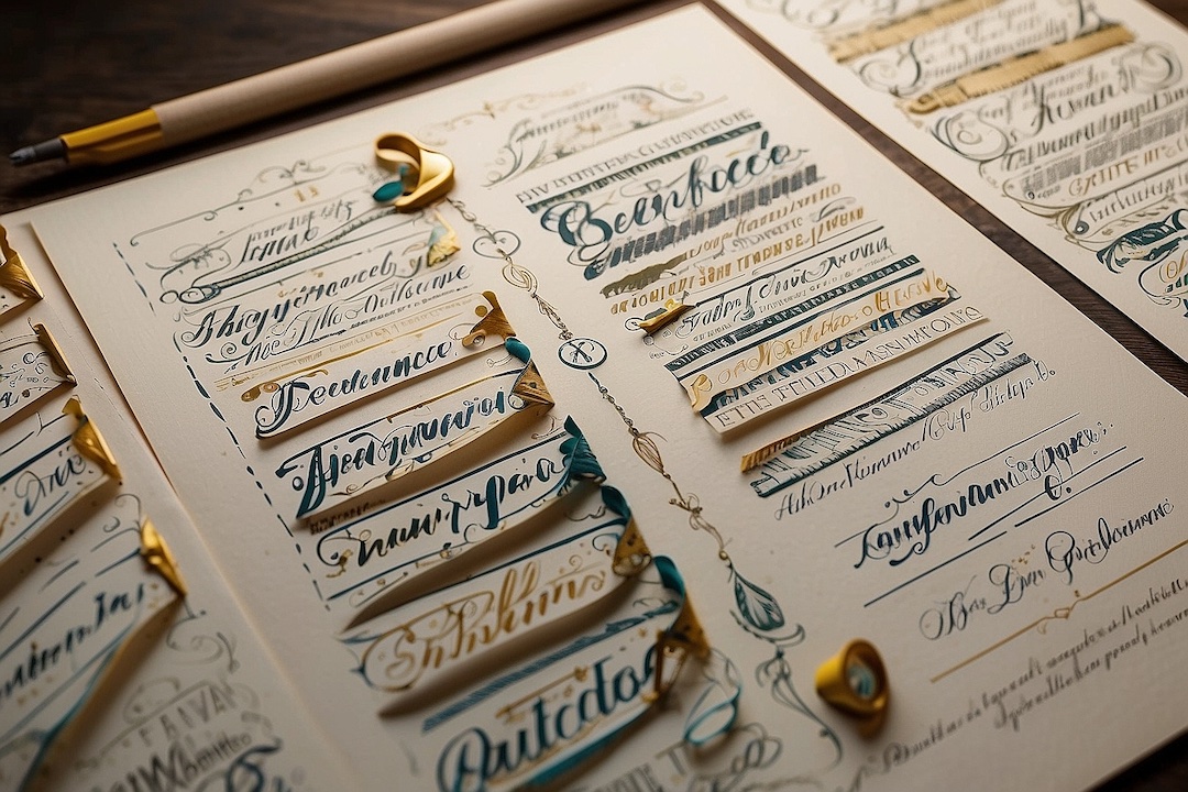
- Handwritten Fonts: In an age where personalization is valued, handwritten fonts add a touch of authenticity and warmth to designs. Whether it’s casual scripts or elegant calligraphy, these fonts inject personality and charm into typography.
- Mixed Typography: Mixing different fonts and styles within a design creates contrast and visual interest. Pairing serif with sans-serif, or combining bold and delicate typefaces, adds dynamism and depth to compositions.
- Experimental Typography: Pushing the boundaries of conventional typography, experimental fonts challenge norms and spark creativity. From abstract shapes to unconventional layouts, these designs captivate audiences and leave a lasting impression.
- Bold and Playful Typography: Vibrant colors, exaggerated letterforms, and playful compositions catch the eye and convey a sense of energy and fun. Bold typography makes a statement and commands attention in both digital and print media.
Not-So-Hot Trends:
- Overly Ornate Fonts: While ornate fonts have their place, overly decorative typefaces can clutter designs and diminish readability. Simplified, clean typography often proves more effective in conveying messages clearly and succinctly.
- Generic Sans-Serifs: Generic sans-serif fonts, such as Arial or Helvetica, lack personality and fail to differentiate designs. Opting for unique, bespoke sans-serifs or exploring other font categories adds character and distinctiveness to typographic compositions.
- Overused Script Fonts: Script fonts are undeniably charming, but overuse can lead to cliché and dilute their impact. To maintain freshness, designers should seek out lesser-known script fonts or combine them with other styles for a unique twist.
- Poor Legibility: Regardless of trends, legibility remains paramount in typography. Complex, overly stylized fonts may sacrifice readability for aesthetics, ultimately hindering communication. Designers should prioritize clarity and legibility to ensure messages are easily understood.
- Static Typography: In today’s dynamic digital landscape, static typography can feel outdated. Interactive typography, animated text, and kinetic typography engage audiences and enhance user experience, breathing life into designs.
As trends continue to evolve, staying abreast of typography’s ever-shifting landscape is essential for designers. By embracing innovative techniques and pushing creative boundaries, designers can leverage typography to captivate audiences and communicate effectively in a visually saturated world. Whether it’s experimenting with variable fonts or embracing the charm of handwritten type, typography remains a powerful tool for shaping narratives and forging connections in design.


0 Comments